4° West A High-Energy Visual Identity for an Urban Sports Festival
This project involved creating a dynamic and edgy visual identity for "4° West", a conceptual urban and coastal sports weekender held in Swansea. The festival combines activities like skateboarding and graffiti with surfing and paddleboarding, targeting a young, alternative audience.
-
Sector: Events, Youth Culture, Sports
-
Discipline: Event Branding, Poster Design, Typography
-
Role: Graphic Designer
-
Outcome: A vibrant visual identity.


The Brief & The Challenge
The challenge was to design a brand identity that would capture the raw, high-energy spirit of street and sea sports. The visual language needed to feel authentic, rebellious, and stand out from typical, more corporate event branding. The key was to create a look that would resonate with the local youth culture and generate excitement for the free event, effectively communicating a large amount of information (locations, dates, activities) in a visually cohesive way.


The Research Process
I analysed historical and contemporary poster designs to understand what determines their effectiveness, delving into design movements such as Bauhaus and the Swiss Style.
An important part of the process was field research. I conducted photographic documentation in Swansea, scouting potential locations for murals and analysing existing advertising media to understand the local visual context. My research also covered an analysis of the philosophy of skateboarding culture and drew inspiration from artists like Tony Plant and Antony Gormley, whose work connects art with the coastal landscape, which was key to the festival's concept.
Typographic Time Travel
I created unique letterforms using manual techniques, such as cutting shapes from cardboard or using insulation tape. These physical experiments allowed for the creation of authentic, imperfect shapes that were then scanned and digitised, becoming a unique foundation.


Experiments
I created abstract patterns and letters using handmade brushes and splashed ink, searching for forms that could convey the energy of graffiti and water sports. In the digital realm, I experimented with different typographic systems described in Kimberly Elam's book, combining radial and random systems to achieve a dynamic yet legible text composition for the posters.

Exercise
This work, inspired by the deconstructivism style of David Carson, allowed me to freely play with typography and composition, resulting in many "happy accidents" and new ideas that influenced the final raw style of the festival.


Logo
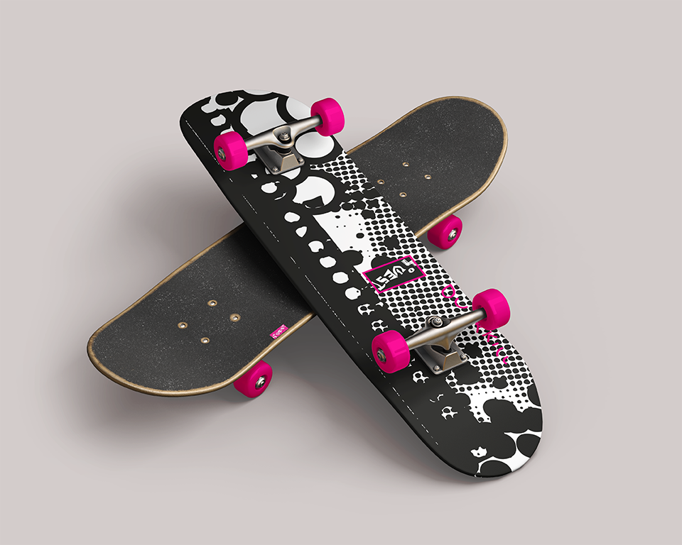
The logo design process was deeply rooted in the festival's symbolism. The final '4°WEST' logotype is full of hidden meanings: the letter 'T' references a climbing piton, 'E' the shape of a surfboard deck, and 'W' a trident and an anchor from Swansea marina, connecting the festival to the sea . To give the logo a raw, urban character, I applied a cracked wall texture, referencing the aesthetic of street art and the abandoned spaces utilised by skaters
Bus Shelter Poster
The main goal of the posters was to attract attention and convey a large amount of information legibly. I applied an aesthetic based on high contrast, neon pink, a halftone texture, and the 'censor bar' technique to increase text visibility . The typographic composition was based on the systems from Kimberly Elam's book, creating a dynamic, radial layout that guides the viewer's eye through all the key information.


Flyer & Prototyping
The flyer design was an exercise in user experience (UX) thinking. Knowing that flyers often end up in the bin, my goal was to create something of value. A key stage was prototyping. I printed and physically folded different versions to test how they felt, and which format ('V-fold' or 'Z-fold') was more practical. On the reverse, I placed useful information like a map, QR codes for navigation, and transport details, deliberately omitting timetables to save space and not overwhelm the user
The Outcome
The result is a bold and memorable visual identity that perfectly encapsulates the festival's energetic and rebellious spirit. The promotional posters are designed for high impact, ensuring they are highly visible on the street and stand out on social media feeds, appealing directly to the target demographic.
